CASE STUDY · 2026 · LEADERSHIP
Metric Overload &
Executive Blindness
A short case on UX leadership under constraints.
Context
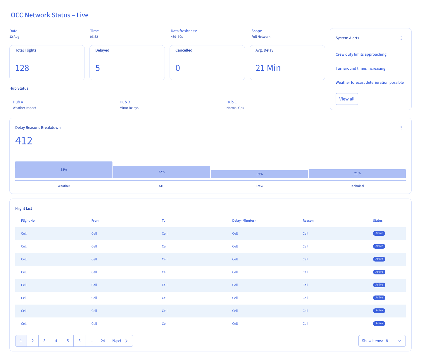
This case examines a product leadership team responsible for a complex, data-heavy platform. The organization had a mature analytics infrastructure, dozens of product and operational KPIs, and regular executive dashboards.
On paper, decision-making was data-driven.
In practice, it lacked direction.
The Real Problem
Product leadership was not missing information. They were overexposed to it.
Dashboards surfaced growth, engagement, performance, and operational metrics simultaneously — all competing for attention. When everything is visible, nothing becomes decisive.
The Decision
The core question was not how to visualize data better, but:
Which signals should leadership act on — and which should be intentionally ignored?
This was not a visualization problem. It was a decision-authority problem.
The Constraint
Reality imposed hard limits:
- Product leaders had limited time
- Decisions were made mid-meeting
- There was no appetite for learning new systems
Any solution requiring deeper analysis, additional interaction, or explanation would fail. UX had to reduce complexity without reducing responsibility.
The Alignment Trap
The instinctive UX response was predictable: group metrics logically, add context and explanation, and improve visual hierarchy.
Dashboards became clearer — but decisions slowed. Executives spent more time comparing and debating, not committing.
The Shift: From Visibility to Governance
The reframing was simple but decisive:
❌ What
should we show?
✅ What
are leaders allowed to decide from
this view?
UX shifted from organizing information to governing decision-making.
Before (Passive Monitoring)
The interface is legible, data is readable...
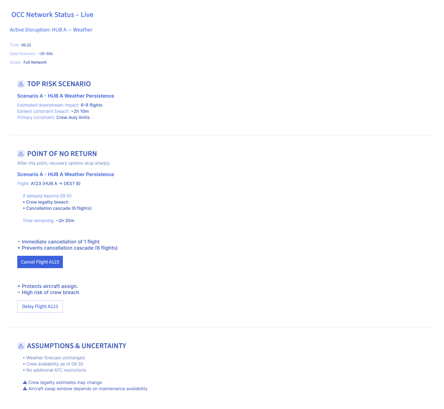
After
With this view, the user acts on system-identified risks...
The Governance Strategy
1. Forced Metric Scarcity
Each dashboard view was designed to support a single decision. All other metrics were removed or pushed out of sight. Visibility became intentional, not comprehensive.
2. Explicit Metric Ownership
Every visible metric answered three questions: Who owns it? What decision does it support? What action does it enable? Metrics without agency were excluded. Data without action was treated as noise.
3. Direction Over Precision
Exact values mattered less than movement. Executives saw trends, directional signals, and risk indicators — not raw numbers. The goal was alignment, not accuracy.
What We Intentionally Did Not Do
Constraints mattered most here. We did not:
- Build drill-down experiences
- Add filters or custom views
- Enable metric exploration
Exploration creates insight. Decisions require commitment. This system was built for the latter.
Resulting Behavior Shift
BEFORE
- Meetings revolved around interpreting numbers
- Metrics competed for attention
- Decisions were deferred
AFTER
- Fewer metrics were discussed
- Decisions happened faster
- Accountability became clearer
The biggest win was not clarity. It was decisiveness.
My Role
I led the metric governance initiative end-to-end. I facilitated workshops with product leadership to identify decision-critical metrics, defined the metric ownership framework, and designed the decision-focused dashboard architecture. I made the controversial call to remove 80% of visible metrics from executive views — a decision that required direct buy-in from the CPO.
Impact
- — Reduction in average decision time in leadership meetings
- — Reduced visible KPIs in executive view
- — Increase in decisions closed per meeting
What This Taught Me
UX leadership is not about helping people see more. It is about deciding what they no longer need to see. In executive contexts, restraint is a design skill.
Closing
This was not a case about simplifying dashboards. It was about protecting product leadership from metric-induced blindness — and restoring intentional action.
Good UX does not add insight. It removes distraction.